
It’s raining outside. Must be Bike to Work Week. Thousands of riders are commuting by bike this week and logging their trips online, but just how popular is cycling in Vancouver?
I’ve heard some people claim that only 1.7% of people in Vancouver bike, while criticizing the investments in new bike lanes the city has made. That’s bullshit.
The number comes from Statistics Canada, but is often misunderstood and misused. The 2011 long form census (now optional and called the National Household Survey) has the following question:
How did this person usually get to work? (Their emphasis, not mine)
- Car, truck or van – as a driver
- Car, truck or van – as a passenger
- Public transit
- Walked to work
- Bicycle
- Other method
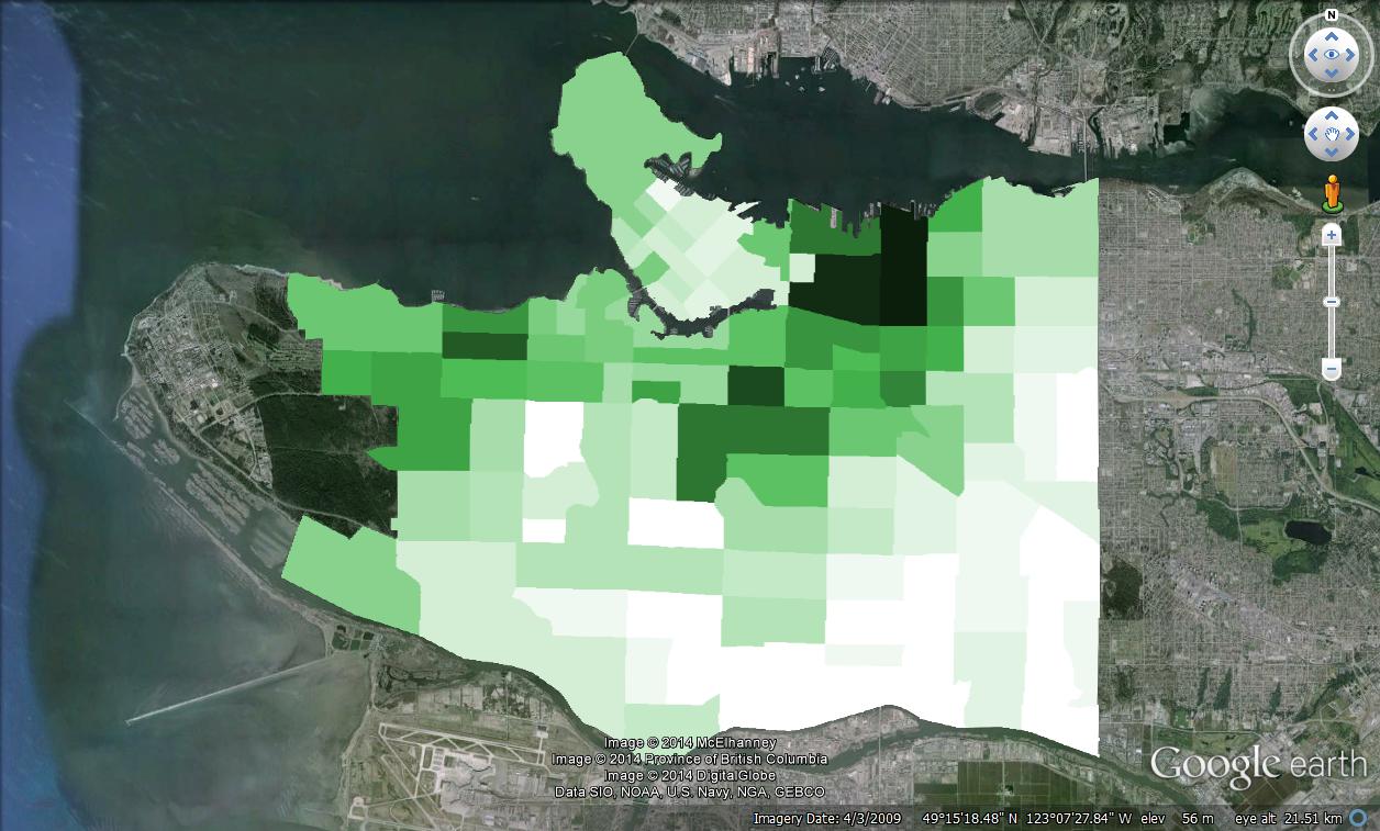
Across all of Metro Vancouver (including the burbs), 1.7% usually commute by bike. In the City of Vancouver it’s 4.3%. The neighbourhoods around downtown have cycling mode shares of 15%, but in southeast Vancouver there are many areas where no one bikes, or so the stats seem to indicate (full searchable results). It’s important to consider what the statistics represent.
The question asks what the usual means of commuting is. Think of all the recreational riders, weekend warriors, and fair-weather cyclists (cycling volumes often double in the summer vs the winter). It’s unlikely casual cyclists would identify the bicycle as their usual means of commuting to work. Unfortunately, the NHS doesn’t ask people what means of transportation they sometimes use, and there aren’t any other comprehensive data sets available. The NHS survey results might under-represent cycling but it does indicate a minimum level that cycling has reached (it’s safe to say at least 4.3% of Vancouverites commute by bike) and it offers a good opportunity to create maps and see trends over time.
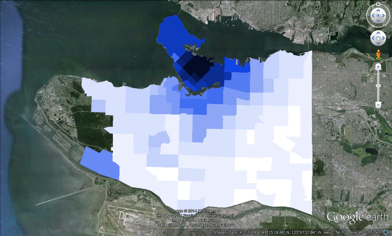
Here’s are the Vancouver maps of commuting patterns in 2011 for cycling, walking, and public transit. The Vancouver Sun created similar maps a few years ago with 2006 census data. In 2006, the highest mode share for cycling was 12% in South Cambie. In 2011, Grandview-Woodland had 15% bike commuters, Strathcona had 14%, Mount Pleasant had 13%, and Kitsilano, South Cambie, and Riley Park had 12%. For the walking and public transit, the darkest areas represent mode shares of close to 50% (for walking in the West End and transit in Marpole and Renfrew-Collingwood).

If you want to play with interactive maps, you can open these files in Google Earth:
biking.kml
walking.kml
transit.kml
I generated these maps using KML files from techearth.net as a base. I would be easy to generate heat maps for all of Metro Vancouver, but I couldn’t find a kml file with census tract boundaries for more than the Vancouver proper.

Pretty similar from where I live. We don’t have bike lanes and I can only count the number of establishments that has bike racks. So I think by percentage, it’s almost the same. Only a few commute by bike. By few, that already includes me. Not too many people find the bicycle as a sensible means of commute.
LikeLike
This totally explains why some people think that a very small minority cycles and why others can’t imagine that someone could not have noticed all the many people cycling. It all depends on what neighbourhood you’re normally in.
Another perception effect is if you’re driving through an area daily on an arterial but don’t live there, you might not even be aware that a block or two over, parallel to the street you’re driving down, thousands of people are cycling on a greenway. You only see the occasional person on the arterial and then make a conclusion.
LikeLike
By the way, did you know you made the Cycling Embassy of Great Britain’s bike blog roundup this week?
http://www.cycling-embassy.org.uk/blog/2014/11/03/the-great-big-day-of-the-dead-bike-blog-roundup
LikeLike
I saw that. Great honour.
LikeLike